Close

Complements All Around
Lesson Plan, Grades 3-8, Art, Art History, Science, Crayola, Drawing, Mixed Media
Description
Lesson Plan and Artwork by Dana DuMont
Using abstract and unexpected color in a composition allows artists to give subject matter an expressive twist. Works by artists including André Derain, Bisa Butler, and Holly Coulis will inspire students to review or be introduced to complementary, contrasting, and abstract uses of color. Layering Crayola Pastel crayons and colored pencils, along with Bold & Bright markers and construction paper crayons, will allow students to develop rich drawings that highlight their skills and knowledge.
Objectives
- View and consider works by artists including Derain, Butler, Coulis and the Fauves.
- List complementary, warm, and cool colors. Discuss tints, shades, contrasting colors, and color abstraction.
- Create compositions that add complementary color pairings and abstract colors throughout the drawing.
- Display work and note uses of complementary and other purposeful color schemes within the compositions.
Supplies Needed
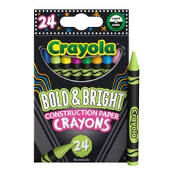
Crayola® Bold & Bright™ Construction Paper Crayons, Assorted Colors, Set of 24
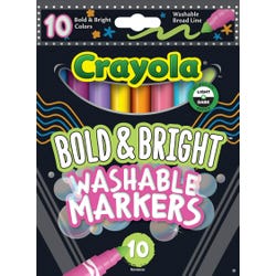
Crayola® Bold & Bright™ Washable Markers, Broad Line, Assorted Colors, Set of 10
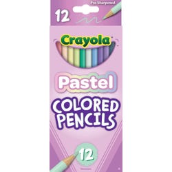
Crayola® Crayons, Assorted Pastel Colors, Set of 24
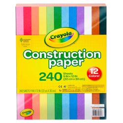
Crayola® Construction Paper Asst Colors 9 x 12, 240 Sheets
Crayola® Colored Pencils, Assorted Pastel Colors, Set of 12
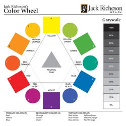
Jack Richeson™ Individual Large Color Wheel Teaching Chart, 7 x 7”, Pack of 30
*Here are the supplies needed for this lesson plan for reference. Find a convenient carousel of shoppable products for this lesson below.
Standards
Standard #1: Generate and conceptualize artistic ideas and work.
Standard #2: Organize and develop artistic ideas and work.
Standard #9: Apply criteria to evaluate artistic work.
Instructions
1
View a sampling of realistic still lifes, portraits, and landscapes by artists such as Luis Meléndez, Rembrandt, Sofonisba Anguissola, Loïs Mailou Jones, or Aaron Douglas before viewing works by artists including Derain, Lisa Butler, Holly Coulis, and the Fauves.
2
Discuss what the artistic purpose and effect of using complementary, contrasting, and abstract color in a composition may be. Then explain the science behind complementary colors. Basically, the photoreceptor cells in our eyes react to different wavelengths of light and send messages, or colors, to our brains via our optic nerves. We find opposite colors, or complements, pleasing together because these colors are dynamic pairs. Test this by staring at a bright blue sheet of paper for 20 seconds and then look at a white wall to see an orange afterimage. Red/green and purple/yellow will also work.
3
List and review complementary, warm, cool, and abstract colors as well as tints and shades. Color wheels and charts are handy tools. Older students may add tertiary colors to their lists.
4
On Crayola colored or black construction paper, draw a still life, portrait, or landscape composition with a pale-colored pencil.
5
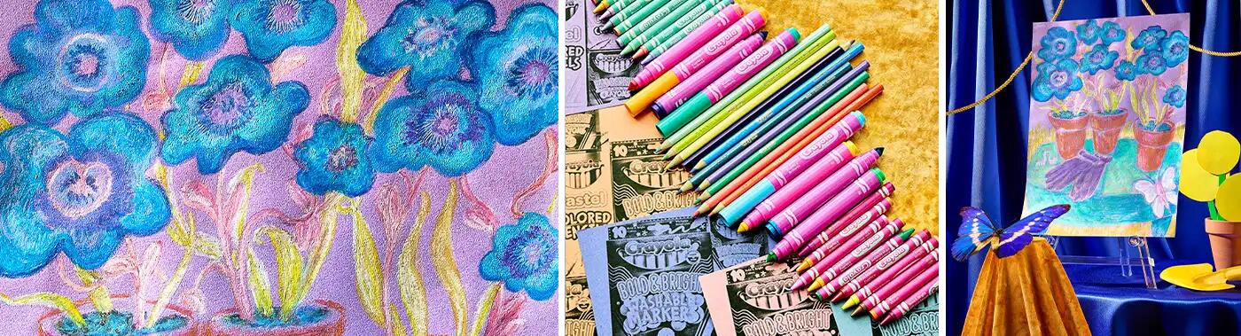
Decide on a color scheme and fill in the darkest colors with Crayola Bold & Bright markers. The Bold & Bright markers are a base layer only. Next add some of the lighter areas with Crayola Pastel colored pencils, leaving bits of the paper color as outlines, undertones, or background color.
6
Layer Crayola construction paper crayons and Pastel crayons to create blends, tints, and shades while being sure to consider complementary color pairings and abstract colors throughout the drawing. The crayons blend easily with each other and on top of the markers and colored pencils.
7
Display finished work, then assign small teams and ask them to find all the complementary and other purposeful color schemes within the compositions. Congratulations to the artists who use adjacent complements and the teams who notice the most pairings and schemes.