Close

Color as Form
Lesson Plan, Grades 9-12, Art, Art History, Science, Chroma, Painting, Mixed Media
Description
Lesson Plan and Artwork by Phyllis M Annett
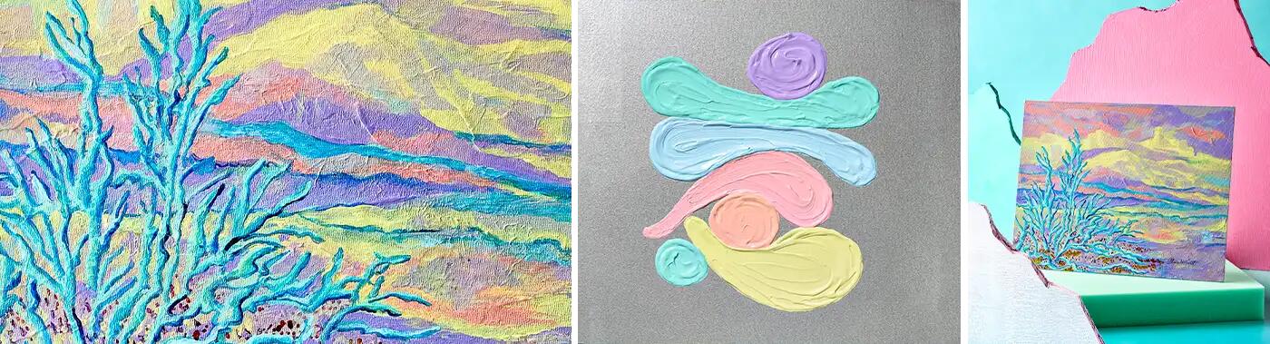
Using Chroma’s Chromacryl Pastel Colored Acrylics, vibrant Chroma Drawing Inks, and Chromacryl Texture Paste, a mixed media landscape will be created to illustrate “Color as Form.” Inspired by historical and present-day artists, students will create a non-representational landscape grounded in reality and bordering on abstraction. This is achieved by treating ‘“Color” as a structural form through color mixing, shadow, light, contrast, and painting techniques.
Objectives
- Recognize art and science relationships through color theory
- Build form with the application of light, shadow and contrast as well as painting techniques with color.
- Develop a composition for the non-representational landscapes using the Elements and Principles of Design.
Supplies Needed
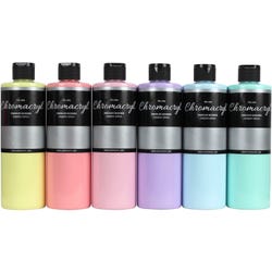
Chromacryl® Students’ Acrylic Paint, Pint, Assorted Pastel Colors, Set of 6
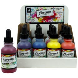
Chroma® Acrylic Drawing Ink, 2 Oz, Assorted Colors, Set of 12
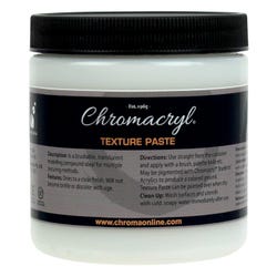
Chromacryl® Texture Paste, 8 Oz.
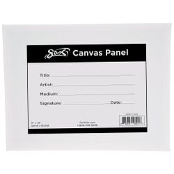
Sax® Genuine Canvas Panel, 11 x 14”
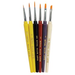
Royal & Langnickel® Golden Taklon Detail Brush Set, Assorted Size, Set of 6
School Smart® Paint Tray
*Here are the supplies needed for this lesson plan for reference. Find a convenient carousel of shoppable products for this lesson below.
Standards
Standard #2: Organize and develop artistic ideas and work.
Standard #9: Apply criteria to evaluate artistic work.
Standard #10: Synthesize and relate knowledge and personal experiences to make art.
Instructions
1
Show student examples of “Color as Form” in various prints, videos, virtual museum tours etc. The following artists from various genres used this technique in their work: Wolf Kahn, Rothko, Hoffman, Albers, Sargent, Dali, Van Gogh, Monet and Degas. The success of these artists is attributed to the fact that each of them limited the size of their work, used a limited color palette, and focused on specific subject matter. This allowed time for detail and focus in their work. With these techniques, color schemes instantly can remind us of a particular artist. Color, shape and form is their identity. Great examples of non-representational art are Van Gogh’s “Starry Night” and Edvard Munch’s “The Scream.” Their paintings have shape, line, color, shadow and express emotion or feelings through the forms they make from specific types of brushwork.
2
The subject is non-representational landscapes, bordering on abstraction with an “other-worldly atmosphere.” Shapes or structures can be geometric or organic in nature, or both. If you are using a photo and/or a print as reference, squint your eyes to see the essence of the shapes and values in the composition. Composition can be gleaned from combinations of many sources of inspiration.
3
After viewing examples of “Color as Form,” students will make small thumbnail sketches to work out ideas for possible compositions. Set these aside.
4
Students review painting techniques and create them on small pieces of canvas with Chromacryl Pastel Acrylics in preparation for their painting. To build form, identify your light source. Remember, light and contrast build form!
5
Treat each shape as if it is 3-D. It is very similar to the way we shade cones, cubes, and spheres in gradient steps to give them a 3-D look, an illusion of form.
6
Use pieces of canvas to create color mixtures and charts for reference and to inform color scheme decisions. Remember the Chromacryl Pastel Colored Acrylics are opaque and dry relatively fast. Set these aside.
7
Make a mixture of Chromacryl Texture Paste and Chromacryl Pastel Acrylics in a neutral color. Using a palette knife, lay down a low-level undercoating over the canvas panel substrate. The result adds depth to the painting and character to the undercoating. NOTE: The more Chromacryl Texture Paste you add to your paint, the thicker it becomes. Dry this overnight.
8
When the composition and color schemes are worked out, take the coated canvas panel and use color mixes of the acrylics to block out lights and darks. NOTE: The Chromacryl Pastels are similar in value and intensity.
9
Keep layering on the blocked-out shapes. Create tiers of depth to create form. Build gradient layers of paint, to add detail. Many successful non-representational landscape artists built form by laying bands of color down. Then they added short strokes of color on top of the band and used the Sgraffito technique of scraping layers away to expose some of the base color for depth.
10
Work from background to middle to foreground, from dark to light. Each tier of the landscape gets brighter and more detailed. Build form with color! Contrasting colors give more form and depth. Analogous colors give the work great unity.
11
As a final step, apply Chroma Drawing Inks as line to the painting with detail brushes.
12
Once the painting is completed, evaluate the work of the class. Proudly display the landscapes and enjoy them.