
Close

School Specialty Web Style Guide
A work in progress!
Brand Identity
- Brand Mission Statement
- Our Vision
- Our Values
- Brand Personality
- Target Audiences
Other Images
thumbnail images, product images, responsive images... all other things jpg and png!
Subnavigation
Sometimes a page utilizes anchor links to help a user jump back and forth between sections on the same page. We have a few ways to present anchor links on our marketing pages.
Defaults
Standard web elements as they are with alternative styling options depending on application.
- Links
- Body <p> text
- Font sizes & weights
Accessiblity + SEO
Guidelines on visual design and HTML formatting that ensures users of all abilities can access our content + SEO best practices.
Headings
Default styles for H1-H6, when to use each, why ordering and semantics matter heavily here, and other style alternatives.
Writing for the Web
Best practices, brand voice/tone across all digital marketing (web, social, email).
Lists
Best practices for when and how to use lists + formatting options.
- Ordered lists
- Unordered lists
Spacing
Explain ideal spacing between elements on a page, line-height, give examples & helper classes...
Brand Identity
From crayons to curriculum to comprehensive learning environments, we offer over 150,000 products thoughtfully designed to work together to elevate outcomes and transform not just schools, but students themselves.
Brand Mission Statement
School Specialty provides best-in-class products and services to transform more than classrooms.
Our Vision
To engage and inspire, with everything from crayons to curriculum to complete learning environments.
Our Values
People • Passion • Purpose
We demonstrate our values in these ways:
Communication
Clear, open communication in a place that all can access as needed
Collaboration
We leverage diverse talents, perspectives, and resources that challenge and push us forward as we work together on similar goals
Customer Satisfaction
Creating an effortless experience for our internal and external customers
Continuous Improvement
Lead by example and strive for excellence every day
Commitment
To do your best and treat everyone with dignity and respect
Brand Personality
Helpful, approachable, trusted, proven, resource...
Target Audiences
Four key personas our customers represent
Victor
Superintendents, School Board Members, Business/Purchasing Directors
DeAnna
Principals, Curriculum/Instruction Directors and Coordinators, Academic Assessment Directors
Amy
Classroom Teachers, Specialty Teachers, Instructional Coaches and Aides
Faye
School Secretaries, Administrative Assistants, Finance/Purchasing Director
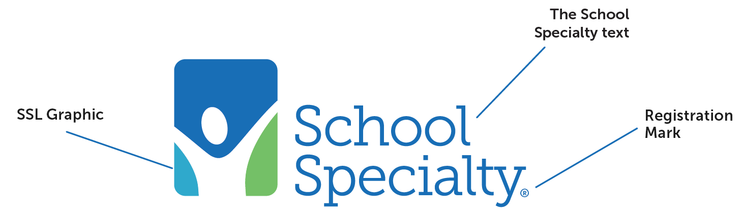
Logo
Our logo is a visual representation of our brand.
The victory logo symbolizes the success, joy, and endless possibilities that exist among educators, students, and School Specialty.
The School Specialty logo consists of the following elements:
This is the main logo and should be used whenever possible, unless size constraints prevent such use. Whenever possible, the School Specialty logo is to be used in its entirety.
The School Specialty logo must always be presented as clearly as possible. For this reason, backgrounds must be controlled to ensure proper contrast. “Busy” backgrounds must be avoided as they detract from the clarity and impact of the logo. Also the format of the logo must not be altered in any way.
Colors
Primary Dark Blue
HEX #0f6cb6
CMYK 94-54-0-0
RGB 15-108-182
Primary Green
HEX #72c267
CMYK 66-0-87-0
RGB 114-194-103
Primary Light Blue
HEX #00a9cc
CMYK 86-5-15-0
RGB 0-169-204
Tip: Use rgba background colors to create tints of our primary colors. This can assist in situations where easier readability and color contrast is desired.
Example:
A featured heading
Uses CSS: background-color: rgba(114, 194, 103, 0.2);
The background color uses the rbg value for our primary green, where the a (alpha) value has been adjusted to create sufficient ADA-compliant contrast.
icons content
Lorem ipsum dolor sit amet, consectetur adipiscing elit. In placerat vel nibh eu dignissim. In hac habitasse platea dictumst. Nulla id elit molestie leo varius tincidunt eu sit amet nulla. Integer vel sem purus. Sed condimentum nunc vel vestibulum congue. Sed eget ex vehicula, tristique risus gravida, commodo neque. In hac habitasse platea dictumst. Nullam vestibulum elit et mi lobortis venenatis. In hac habitasse platea dictumst. Praesent id urna ornare, finibus purus id, tristique lectus. Nam condimentum aliquet metus, sit amet feugiat massa venenatis non. Donec at aliquet ex. Quisque in massa sit amet massa sodales accumsan. Maecenas eget lorem ultrices, feugiat massa a, hendrerit elit. Phasellus sit amet rhoncus libero. Pellentesque sagittis lorem purus, ac tempus augue mattis sed.
Nulla facilisi. Ut nec tortor placerat, vulputate justo volutpat, vulputate magna. Vivamus vitae nibh et massa ornare iaculis. Curabitur consequat in ipsum sit amet maximus. Integer fermentum vestibulum purus, a dictum purus pharetra ac. Aliquam dignissim, turpis id bibendum pulvinar, ligula tellus congue nisl, efficitur rhoncus purus augue eleifend massa. Nulla facilisi. Ut in magna vel diam porttitor faucibus eget at dolor. Suspendisse porttitor est nec nisi bibendum, quis pharetra justo fermentum. Donec vitae lobortis risus, ac iaculis ex. Cras in felis ac purus placerat laoreet vel eu elit.
Buttons + Links
Button Styles
Naming Best Practices
Sometimes a call to action may be an actual action such as "submit," shop now" or "next." In other cases, link text should be descriptive rather than imprecise words such as "click here" or "learn more."
Keeping links descriptive makes our website more accessible, helps search engines crawl our content effectively, and assures the user of what's happening next.
Visually-impaired users need to hear links' meanings, and many non-visually impaired users may skip reading paragraphs and quickly scan links/buttons looking for definitive links that help them find what they need.
Link text should be short and concise, ideally 2-3 words. Examples: "Explore Sax products" or "Read the blog."
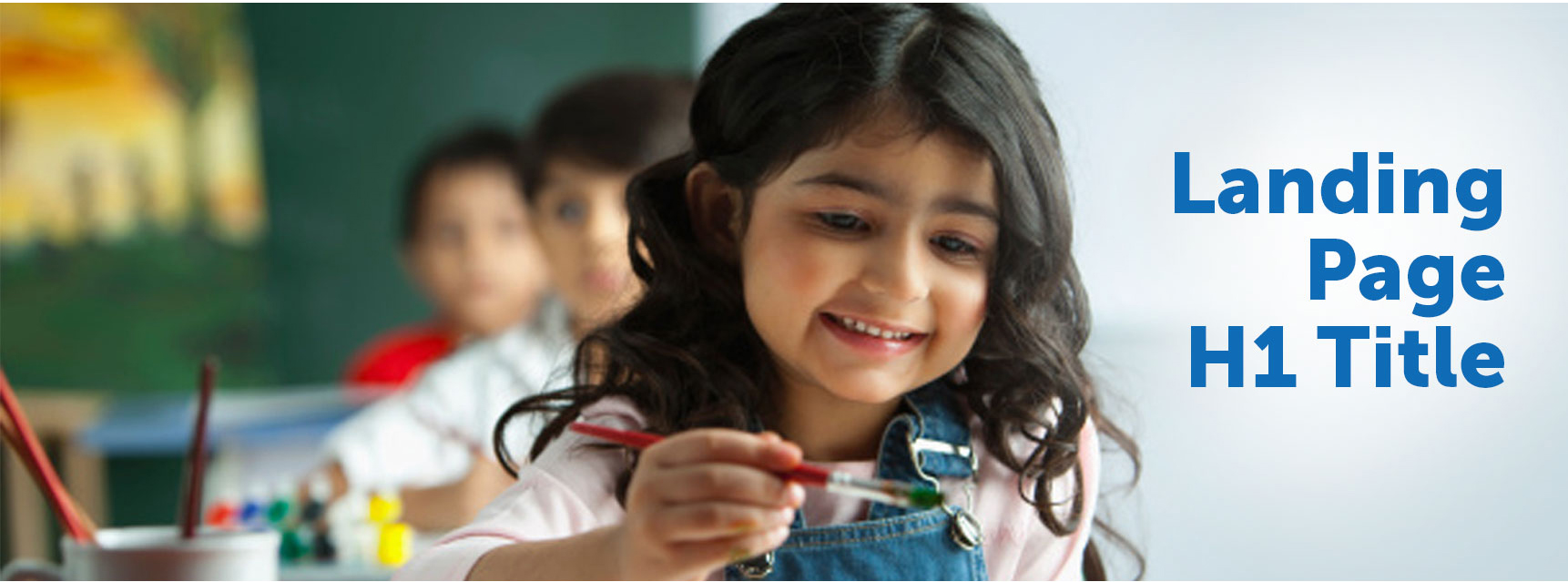
Hero Banner Style
Classic Rectangular Stock Photo Banner
This banner style is inherited as the standard heading of a marketing page. Proper usage should be considered. There are concerns about accessibility, such as text over images not being ADA compliant in most situations. High contrast is important to ensure legibility. Further reading
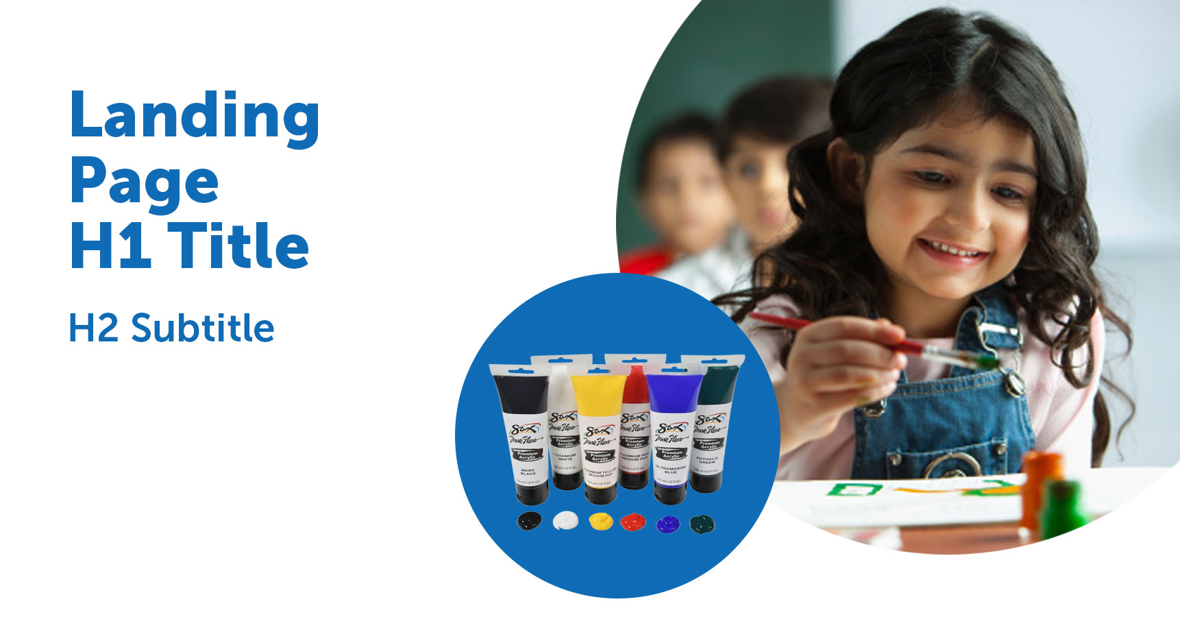
Open Shapes
An "open" look and feel for page hero allows for large typography and tying in SSL shapes branding.
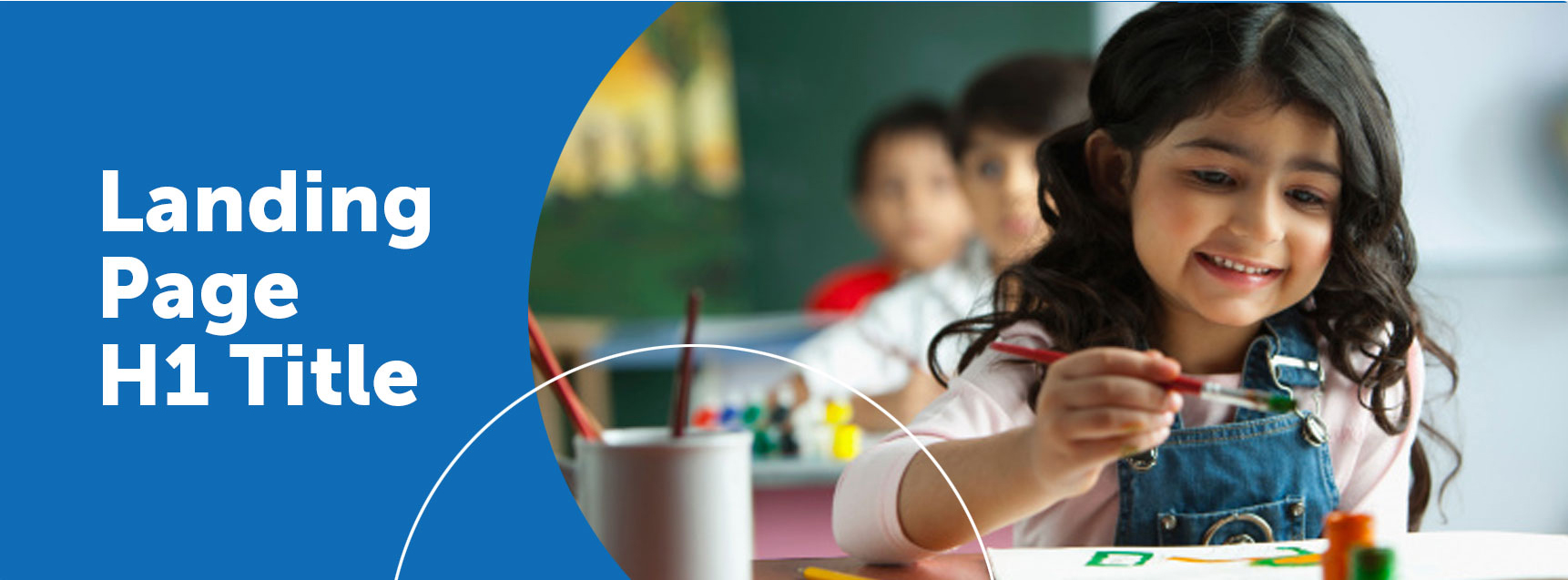
Hybrid Shapes
This banner styles incorprates circles into the traditional retangular banner.
Other Images
Alt Text
Images should always contain alt text. Most importantly this contributes to an accessible web, and it also helps search engines better understand our content. Example: "smiling elementary student painting at school" or "yellow math dice with black numbers" or "Champion Rhinoskin PE Balls." More on Accessibility + SEO
Lifestyle v. Product Photos
website marketing images should be comrpised of a combination of lifestyle and product images. It's important to consider which type of image best tells our story on the website. Generally, product images should be used when the content block is able to be represented by a singular product. When a page or a section incorporates more than one category, and can't be adequately represented by a product image, you may prefer to choose a lifestyle image.
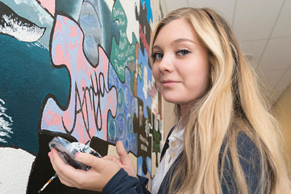
Lifestyle Photo Style
Child or adult has natural expression, gently visceral, caught in the moment — not staged or forced. The student may be involved in an activity related to subject matter, either with props, be in an identifiable environment or implied. Background helps create dimension without competing with the subject’s face.
Lifestyle Photo Examples


Product Image Guidance
When choosing a product to feature, priority should be given to proprietary brands first, or strategic vendor partner brands. Avoid product photos that are overly complicated - the products we feature should be simple, easy to identify and visually appealing.
Product Block Examples
Different content needs - for example: available space and numvber of product/category blocks - may dictate a need for different styles. Here are a few examples.
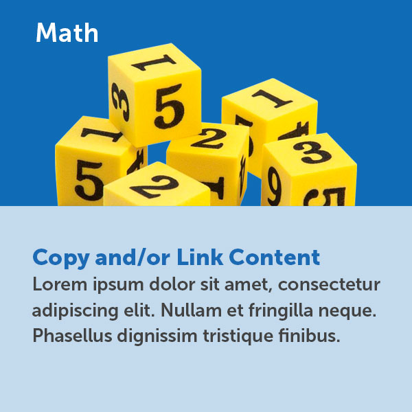
large product block with additional copy and/or link content
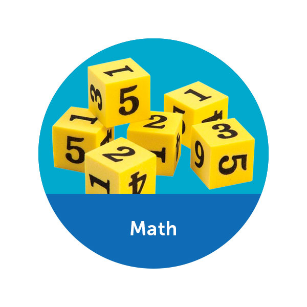
medium product block
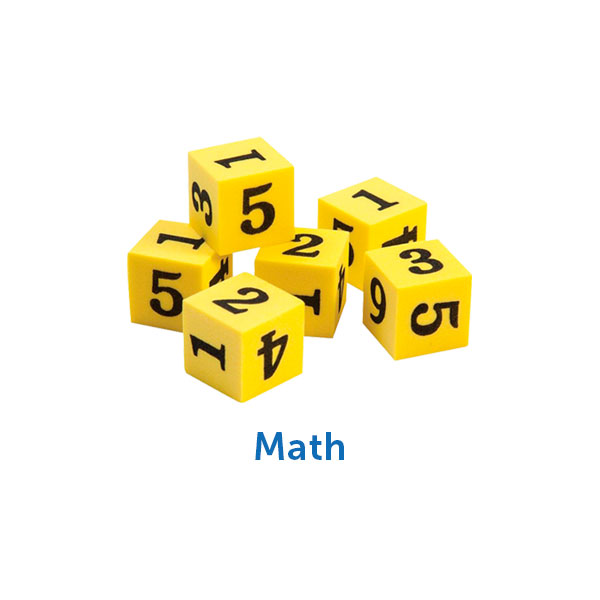
small product block with thumbnail
Accessibility + SEO
Best Practices
Aenean accumsan, tortor vel ornare consectetur, ex urna eleifend erat, iaculis tempus nisi magna non arcu. Etiam vitae facilisis velit. Donec malesuada tortor dolor, a semper quam mattis ut. Nulla placerat, elit a finibus malesuada, velit nulla pellentesque lacus, ac dignissim risus lacus eget tortor. Aliquam erat volutpat. Sed vulputate aliquam vestibulum. Mauris condimentum ultrices justo, nec tincidunt nunc ullamcorper eu. Etiam ac imperdiet metus. Nunc vitae feugiat neque, eu pretium orci.
Headings
In this section: Style Examples & Best Practices
Heading Style Examples
Numerous heading classes or styling options are available in primary blue, charcoal, or white in various sizes. These 3 colors are best practice for readability and high contrast over light or dark backgrounds.
Giant Blue
Giant Grey
Giant White
Big Blue
Big Grey
Big White
Medium/Large Blue
Medium/Large Grey
Medium/Large White
Medium Blue
Medium/Large Grey
Medium/Large White
Small Blue
Small Grey
Small White
Also see: When you would like to increase the font size of a paragraph beyond the standard "ssi-type__body" class, for example on the "intro text" contained in a hero or featured area, you may use the class "intro-paragraph"
This is an example of an intro paragraph. The text is a bit larger and the line-height is a little roomier. The goal is to the set the text apart from the rest, and give search engines a description of what this page or section is going to be all about.
Heading Best Practices
Headings should describe the page or section's main topic. It is important to make headings meaningful for both users and search engines.
Ex: "Phonics Books for Struggling Readers" vs "Open up their world with the right reader"
The first example above explains to a search engine what kind of content will follow on that page, therefore increasing visibility in search results and site traffic. This is also best practice for keeping our website accessible. Also see Writing Guidelines
Designating a heading as level 1, 2, 3, 4, 5, or 6 should done for semantics, not strictly visual presentation. (i.e. Don't make text into a heading just because you want it to be big and bold.) For example, there may be a one off case where the h1 at the top of the page is not the largest text, and an h3 lower down may be styled more dominantly. Or, if you want to highlight important text, use the <strong> element to make text bold rather than using a heading. Style (use CSS) for presentation, write code (HTML) for semantics.
Example Page Heading Structure: 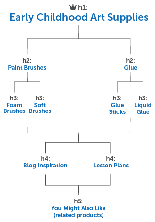
Writing for the Web
Best Practices
Content is king.
Keep content short and concise. Reducing text ensures the important information is most prominent for both humans and machines. Headings should outline the subject of a page in a hierarchy of up to 6 levels (h1-h6.)
Content on the web should answer questions for quick-skimming users and should be considered differently than writing for printed literature. Breaking down information into lists can be helpful. The introductory paragraph is the ideal place to help users and search engines understand what a page is about. Use keywords.
Avoid links that say “click here,” “learn more,” or anything non-descriptive. Some links or buttons may be read out of context, and should make sense to stand on their own in 2-3 words. Also see Links + Buttons
Keep content current and do not copy/paste content from one page to another. Websites with content repeated across multiple pages may rank lower in search results.
Brand Voice and Tone
Copy Voice
Copy voice allows us to create a relationship with our customer. It’s how we build trust, Customers know who we are and what to expect from the products we offer, so they feel comfortable in our brands and their buying decisions.
Our voice is a reflection of how we want our customers to see us: as a knowledgeable, trusted source of information, products, lesson plans and curriculum. We are approachable, passionate about education, the success of students as our top priority, proven, reliable, current trends and issues, updates in standards... xxxxxxx
xxxx straightforward, relatable, authentic, conversational, we use copy that explores and explains the benefits and value of the breadth and depth of our products.
Copy Tone
Copy tone changes based on who we are speaking to. We adjust our copy to meet the needs of the customer, just like in normal conversation.
Based on your audience and subject matter... - celebrating holidays and awards will have a less formal tone, as compared to a straightforward and fact-based tone for subjects like funding, curriculum standards, or literacy.
Web Copy Tone
We speak to the customer like we’re a team. We are here to help them navigate purchasing products that provide the best possible educational solutions for their students and classroom.
Email Copy Tone
Do not use we or us/ speak directly to the customer/teacher as a resource to help them teach ?
Social Copy Tone
Conversational, a helpful informative source for ideas, teacher resources, and lesson plans.